Case Study:
Hack for LA Website
Design System

My Role
UX/UI Designer, Front End Developer
Team
Hack for LA website team
Duration
10 months
Tools
Figma, VS Code, Chrome Dev Tools
The Client
Hack for LA is a nonprofit civic tech organization and subsidiary of Code for America. The primary stakeholder, the Executive Director, wanted their website to be standardized and componentized.
The Project
The Hack for LA website is the face of the organization, and its main purpose is to inform and guide new members to join.
The website was disjointed and inconsistent when I first joined the team. Due to a revolving door of new designers and developers, and without any standard guidance in place, the design and code varied widely from page to page. Headers and buttons should have been the same looked different from one page to another. This made the website feel disorderly and did not present the organization in the best light to our target users.
“Without any guidance in place, the design and code varied widely from page to page.”

With no clear standards to follow, headers throughout the HfLA website had varying layouts.
Even more critical for our stakeholder, important new pages were taking too long to develop. The absence of standards was the problem here as well: most developers built each new page’s components from scratch, instead of reusing code that already existed. This extended the development time unnecessarily.
Even when developers did try to search the website for reusable component code, they often couldn’t find a fit. This was because designers were also regularly designing new components from scratch instead of reusing existing designs.
Without guidance in place to prevent designers and developers from ‘reinventing the wheel,’ this continuous cycle led to more inconsistencies and delays.
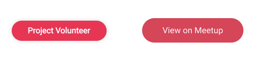
Buttons on different pages had inconsistent styling and code.
UX Challenge
I was originally tasked with ‘componentizing’ the Hack for LA website– breaking down the pages into reusable components, so that we could build new pages more efficiently.
However, after researching current industry standards I realized that we should create a comprehensive design system, since we would already be halfway there with the reusable components. This significantly expanded the scope of the project, and I was put in charge of building the first design system for the website from the ground up. This involved standardizing our typography, colors, reusable components and layouts throughout the website. I was tasked with standardizing the design as well as the code, since I had recently learned front-end development.
As I completed the design system, our Executive Director wanted me to provide guidance for other Hack for LA civic tech projects to replicate my process. This spun off into a separate new project with its own dedicated team. I launched this effort, which is currently ongoing, to create optimized design system guidance through documentation, Figma, and development tools like Storybook so that other projects can follow suit.
The Process
Creating the Hack for LA website’s design system involved researching, auditing, consolidating, organizing, implementing and documenting the HfLA site’s patterns for both designers and developers.
My approach to creating the design system followed Atomic Design, the basis of most design systems– breaking down every page into reusable components (atoms, molecules, and organisms).

Brad Frost’s Atomic Design categories, the building blocks of most design systems today.
After learning about neglected design systems that failed to get enough buy-in from the rest of their organization at the outset, I made sure to include designers, developers and PM’s in the entire process. I provided weekly updates and consulted with relevant parties at every step. I also explained the benefits of design systems and how they work, showing how prominent they are at other companies.
I also regularly attended developers’ meetings to get their input about everything from naming decisions to coding guidance. I tried to make clear that they were the coding experts, and the decisions were up to them collectively.
Over time, this effort helped make the rest of the team feel more invested and involved in the design system, which has ensured its continued success and sustainability.
Research
From the outset and throughout the project, I continuously researched every aspect of creating design systems. There was a lot of contradictory or outdated guidance to sift through online, and much of the information was geared toward large companies with dedicated design system teams that have extensive resources - not quite compatible with the one-man nonprofit design system operation I was working on.
I found it especially insightful examining all of the major companies’ design system websites and Figma files that are publicly available. I also set meetings with design system professionals through the Design Systems Slack Community– everyone from a design system expert in the Netherlands to a US Government designer using the USWDS Design System. They helped me gain real-world insight into design systems in practice, since we lacked an existing precedent to reference internally at HfLA.

Referencing public design systems of companies including Microsoft, Adobe, Salesforce, etc. helped guide my work
Audit
As the first step to creating HfLA’s design system, I first audited all of the colors, typography, components, and layouts in our website. Oftentimes these unfortunately didn’t match the Figma designs (or in some cases the Figma designs were missing completely), so I used Chrome Dev Tools to inspect each component manually on the website, and recreated the pages and components in Figma to accurately catalog the atoms, molecules, and organisms.
This process confirmed the inconsistencies in the website at every turn, from incompatible color shades and heading sizes, to the varying layouts in similar pages.

Auditing the styles of the Getting Started page
I also audited the code for all of the components, and found major inconsistencies there as well. Buttons that were supposed to be the same had different font sizes and code structure, because they were developed separately by different engineers.
Consolidating
After finishing the audit, I laid out components and their variants from different pages side-by-side in Figma, in order to examine and consolidate them. I had to decide which redundant component variants to remove, and which ones to keep as the official variants. I also consolidated the typography, whittling all of the inconsistent headings down to a standard six that would still keep the same hierarchy and style of the website, and following standard font sizing guidelines (multiples of 4/8). I also consolidated the colors throughout the website, removing any that were too similar to each other.

Auditing different page cards throughout the HfLA website
I standardized layouts as well, including details that were relatively small but would save designers guess work. For instance, I standardized the margins in every page (below the header, above the footer, and so on). I also standardized the headers themselves, most of which were supposed to look the same but had noticeably different layouts, and were often unintentionally too large. I designed a standard layout based on the existing variations, with specific measurements for every element (heading, paragraph, illustration and the margins between everything) for consistency.

The website’s headers, after standardizing their layouts.
This consolidation process occasionally seemed arbitrary and daunting at the same time. While the decision between two very similar colors or button sizes was seemingly minimal, at the same time I was setting standards that everyone would always need to follow.

Using this typography audit of the HfLA website, I then had to consolidate and narrow the site down to 6 main headings.
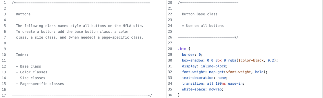
Next, I standardized the components’ code. Hack for LA’s website does not use React (which most major website codebases use nowadays), but instead has a very basic codebase by design. Because of this, I couldn’t follow the standards of most other major design systems that use React. Instead, after extensive research and consulting with the development team, I decided to follow Bootstrap code standards. I created interchangeable and reusable classes that would determine the different properties (size, color, etc.) of our website’s reusable components. With this solution, developers would have an easier time exchanging and reusing different component variants, and avoiding more inconsistencies.

Auditing the existing components (buttons in this case) and their code.
Consolidating and standardizing the code was the most daunting part of the entire project for me. Since I was new to front end development, I felt out of my depth and unqualified to make code decisions for developers. But my extensive research ensured that every decision was backed by precedent, and I ran every step by developers while they focused on other pressing matters. I established that they were the experts and I wanted to make sure this system would work well for them, since they would be using it. I attended developer meetings regularly and ran decisions by them. For example, I consulted with developers about many component naming decisions, as mutually agreed upon names were essential for designers and developers share the same language.

Bird’s eye view of the full HfLA site design system on Figma.
Organizing
Once all of the styles and components were consolidated and finalized, I organized them into a presentable Design System on Figma, which designers would be able to reference from now on. I followed effective standards that I saw in other major design systems, as well as ones that fit the unique use case of our small nonprofit organization.

The Buttons section of the HfLA site Design System in Figma. Due to my unique circumstances of standardizing both design and code, this file includes class names, code, and measurement annotations.
Since I had to standardize both the design and development portions of the design system, I took the rare step of including the code side-by-side with the components in Figma, in order to help communication between designers and developers. I also added annotations to every component, to ensure designers and developers understood at a glance how the components were built. However, soon it became clear that it was unrealistic and unfair to expect developers to look at the Figma design system file to find component code. We addressed this after design and code standardization was in progress (see further below).

The design system includes detailed annotated guidelines for standard page layouts.
Implementation
After the design system was ready and presentable in its Figma file, it was time to implement its standardization guidelines in the actual website.
I implemented the button and page card standardization in the codebase using git. These were the most intricate and widespread changes we had to make because these components existed in nearly every page, so I was most deeply familiar with the changes required. Also following my research and advice from the development team, I created separate files for the buttons and page card files, listing all of the variants and adding explanatory notes so that developers would be able to follow in the future.
I created separate files in the codebase for the reusable components, with explanatory notes for developers.
Once the main components were standardized, I created dozens of Github issues (tickets) for developers to standardize the rest of the website according to the design system. I also coordinated with developers to standardize all mobile layouts, since those were especially inconsistent and had been overlooked before.
Documentation
Documentation for both designers and developers is a must for the sustainability of a design system, and I made sure to add detailed instructions and guidelines for both audiences.
I drafted usage instructions for new and current designers within the Figma design system, along with additional documentation about typography standards and image use guidance.

Typography guidelines in the Design System.
Figuring out how to document all of the specific components for developers turned out to be one of the more complicated steps of this project. I wrote a Github wiki article explaining how to utilize the reusable component classes. However, there had to be a way to communicate which component code is available for developers to reuse.
At first it seemed that a quick fix would be Storybook, a program that many major companies use to document their design systems for developers. However, this hope was quickly shot down because Storybook requires a React or similar codebase, which we didn’t have. I worked with two developers to try to solve this by researching, consulting, and discussing with Design System development professionals via the Design System Slack Community.
In the end, we decided that the best solution would be to manually develop our own design system webpages to document our reusable components for developers. I designed this webpage with a fellow designer, and a developer at the HfLA website built it. With these pages, developers can find the component they are looking for, find out where it is used throughout the site, and copy any code they need - instead of wasting time developing their components from scratch as they used to.

To document the design system’s reusable components for developers without the option of programs like Storybook, a design partner and I designed a dedicated design system documentation website.
Design Systems Spinoff Project
Our stakeholder realized the value of the design system, and wanted all of the other civic tech projects at HfLA to have one as well. She tasked other projects with creating design systems, but she noticed the progress was uneven and they often needed guidance. So she decided that there should be a ‘universal’ design system template and guide for all design systems at HfLA to follow if they wanted. After a false start through another initiatives she asked me to spearhead this.
By distilling the countless hours of research and work I had done to create the HfLA website design system, I could save others from repeating the same, and they could direct their time and energy to other matters instead. Our nonprofit organization was also a unique situation for a design system, and our projects required tailored guidance, since most of the articles online are often slightly outdated, one-sided, and/or geared towards companies with lots of resources and dedicated design system teams.
I recruited 7 other designers to help me conduct additional in-depth research about all aspects of a design system– from colors and typography, to grids, to component libraries. Everyone documented and presented their research topics to each other. Afterward, I combined all of the research and drafted an extensive, 40+ page guide about design systems, which will eventually be posted on the HfLA website when their guides section is complete.

With research help from other designers, I drafted a comprehensive design systems guide to share with other HfLA members that will need to create or work with them.
This whole endeavor then spun into its own project at HfLA, with dedicated PM’s, developers, researchers, and designers. The developers are currently researching and determining the best way to document design systems for developers-- especially because, unlike the HfLA website, most of the other projects at HfLA do use React and can use programs like Storybook, but no one has tried this out before. The research team is working on interviewing members of projects about their experiences working with design systems at HfLA, to determine how to adjust our design system guidance accordingly. I have been leading the designers in creating the Figma template design system that other projects can follow based on their needs.
This project is iterative by nature, and will continually improve over time by following the UX Researchers’ findings.
Next Steps
Design Systems are living documents that are never ‘finished,’ and the HfLA website’s design system is no exception. Developers and designers will continuously improve, update, and iterate upon the design system as they use it, making it better and more sustainable.
With the help of the Design Systems projects’ research findings, it will be especially important to determine the best ways to coordinate between developers and designers to make updates and changes to the design system.
Reflection
Working on the design and code of the HfLA design system from the ground up was a long, difficult, and occasionally even maddening process.
But at this point I know our website inside and out, and have been regarded as our website’s ‘expert’ by both designers and developers due to my work.
This was an invaluable way to become deeply immersed in and familiarized with the website. It also helped me become the Design Lead of the project with the knowledge I gained.
I am excited that this led to a whole new project that will delve even deeper into design systems at HfLA, based on designers’ and developers’ real experiences with design systems. Utilizing research, HfLA design systems– including the one I created– will be continually improved. This work was uniquely challenging because it involved creating something without significant precedent– a design system for a nonprofit organization with few resources. The hope is that the findings from this project may help other nonprofit websites’ design systems in the future.