Case Study:
Hack for LA Website
Roles Page

My Role
UX Design Lead
Duration
4 months
Tools
Figma, Miro, Github, Google Suite
Team
Ashley Lin, Oskar Adam Zloch, Hope Shin,
Alyssa Benipayo, Rosalyn Broddie
The Client
Hack for LA (HfLA) is a nonprofit civic tech organization and subsidiary of Code for America. It partners with the City of Los Angeles, the Mayor of LA’s office, LA DOT (Department of Transportation), and many other local organizations on dozens of civic tech projects to help LA and beyond.

Some of Hack for LA’s partner organizations
The Project
Hack for LA continually matches tech volunteers (engineers, designers, PMs, and more) with its civic tech projects, keeping the organization’s important projects running as previous volunteers move on.
Our research indicated that there were issues with matching volunteers to roles through our website, which was negatively impacting everyone from the volunteers themselves to the projects and organization staff.
To keep the organization running smoothly, we had to find a better way to match volunteers with roles.
“We had to find a better way to match volunteers with roles to keep the organization running smoothly”
UX Challenge
My team was tasked with designing a new webpage that would effectively and intuitively match our new volunteers with project roles, while also prioritizing the requirements of our organization and stakeholder.
The Process
I led my 5-member team in an end-to-end research and design process. I ensured we stayed on track through our team’s Github Kanban board, checked in with our PMs and stakeholder bi-weekly on progress, and ensured our work was vetted and guided by our users.
Research
Improving Volunteer Onboarding
This project was born from our stakeholder’s and PMs’ drive to improve the new volunteer onboarding experience at HfLA.
My team researched the experience of new volunteers at Hack for LA by conducting onboarding interviews, and we found several issues they faced.
One of the main problems we heard about was that volunteers had trouble finding a project role, for several reasons:
Endless scroll through project cards: The only way volunteers could find project roles on the website was through the tedious task of studying the homepage’s endless scroll of project cards, each of which included fine print about which roles they had available.
Outdated role listings: Worse yet, these project cards were usually very outdated because of the complicated bureaucracy involved with updating them.
So volunteers were joining meetings they weren’t supposed to join, and projects that didn’t have space. Or on the flipside, projects went a long time without any new volunteers. Users even sensed this, as several mentioned in their interviews that they weren’t quite sure if the open roles listed were up to date.

Our interviews revealed that because of these problematic and outdated homepage project cards, in practice the real way that volunteers were mostly getting matched with projects was actually through their onboarding leader.
That Hack for LA staff member tried to keep track of which projects needed more volunteers, and was often in charge of ‘matchmaking’ volunteers with projects live during onboarding sessions.
This informal role-matchmaking process posed a lot of issues:
Miscommunication: Since this unofficial process relied on word of mouth, sometimes there was miscommunication about which roles were available for those leading onboarding, and they regularly sent too many new volunteers to the wrong projects – overwhelming the projects and alienating the new volunteers.
Rushed placement: Many volunteers expressed that they wanted time to choose which project fit best for them and assess whether it works with their schedule, instead of immediately being directed to a certain project.
No choice: Some project PM’s wanted the ability to interview and select volunteers for more complicated roles, as opposed to making due with anyone that was sent over to them.
Unsustainable: This process was too reliant on specific staff members’ unofficial channels of communication, which was unsustainable with any staff turnover – not to mention time – consuming and stressful for the onboarding leader in charge of ‘matchmaking.’
We had to come up with a way to systematize this unofficial process and make it work better for everyone involved.

We synthesized our volunteer onboarding research by affinity mapping in Miro, which showed a lot of frustrations in connecting volunteers with roles
“When we need a new volunteer, we usually reach out to [the onboarding lead] begging, or we poach someone from Slack intros”
- Anonymous PM interviewee
Ideation & Design
Based on our interviews, the volunteer role assignment process currently wasn’t working well for anyone. We had to find a solution that would solve this for everyone: volunteers, projects, and onboarding leaders.
My team and I ideated solutions for this problem. We mapped out our user onboarding flows for volunteers, and different ideas for how this can be improved. We played around with different ideas, including even a ‘wizard’ tool on the homepage that would match volunteers with roles based on a Q&A, which was shelved as a potential post-MVP idea.
We eventually gravitated toward one main concept:
Separate Roles page: We felt that a new, separate Roles page would be best for listing available roles, instead of leaving them on the homepage. This way information targeted only for new volunteers wouldn’t take up essential real estate on the homepage, which needed to also appeal to potential donors and partners. This separate page for the roles page would be accessible through the top nav.
Filter: We decided to follow the lead of job boards and include a filter on the roles page. Volunteers can then narrow down the available roles based on the title, type of project, experience level, and schedule they want. These filters were requested by our stakeholder, but would also be tested with users.

Determining new volunteer flow

Early rough sketch of Roles page
Low-Fidelity Designs
Starting out with rough sketches, we visualized how the Roles page and filter concept could look.
We then moved onto low-fidelity wireframes and compared our designs, focusing on whether a horizontal filter on top or a vertical side filter would be preferable.
Based on our previous research of the homepage, users often didn’t notice the top filter. Also, a side filter that would travel down the page with the user was more consistent with our previous designs on the site. So pending user feedback, we decided to focus on the side filter option.

Early low fidelity Roles page designs - trying different layouts for filter and roles cards
Medium-Fidelity Designs
We next moved onto medium fidelity wireframes, designing several different versions of the roles page to run by users as well as our PM’s and stakeholder.
Our stakeholder had emphasized that she wanted to highlight projects and their descriptions in the roles page. This was because, from her own experience with new volunteers, she felt that it was essential information for them. My teammates and I were unsure about this assessment, feeling that adding the description of each project would interfere with a clean organization of the role cards. Not to mention, there was already going to be a Projects page with all of their descriptions.
Project Emphasis
We still did make sure to include options with the roles organized by project, for our stakeholder. For instance, we included an option with a card dedicated to the project description, with the separate role cards below their project.
We felt this would be tough to organize after the user filters results without the results looking distracting and clunky with large project descriptions, but we kept the option for now.
Cards organized by project
Two Card Columns vs. One
Our other main challenge was to figure out the best way to lay out the role cards. While multiple vertical card columns could help users with fast scanning through roles, it would also potentially overwhelm the eye, and wouldn’t allow for as much information to be available upfront about each role. Meanwhile, having one wide card at a time allowed more information, but would be slower to scroll through.

Two role card columns vs. one
Role Description Pages
I also pitched the idea to have each role card link to a separate page dedicated to each specific role description. This way, each role page can be shared or cross-posted to other boards,Slack groups, etc. This would be especially good for leadership roles, which were usually tougher to fill. This idea was quickly given the greenlight by our stakeholder and PM’s.

Role description page
Testing & Iterations
In order to narrow down our options, we ran interviews and preference tests with our users, while verifying that we were on the right track with our stakeholder and PMs.
Reaching a Compromise
Our interviews and early preference testing showed that our stakeholder’s hunch about the importance of project descriptions was correct– to an extent.
Many volunteers did care about project descriptions when deciding on a role. However, they didn’t think this was most important, and didn’t need it to take up a lot of real estate on the page.
Trying to find a compromise that would satisfy all parties, I proposed a middleground: expandable cards that would show the project description if users decided to expand the role card. This way, it wouldn’t take up unnecessary space and cognitive load if the user wasn’t even interested in the role. But if they did have some interest, they could choose to read more about the project as well as the role at that point by expanding the card. Also, for the MVP, the role cards would automatically be organized by project.
This expandable card option was approved by our stakeholders and PM’s, and was included as one of the options in our user preference testing.

Expandable role card
High-Fidelity Designs & Preference Testing
After testing out and validating our medium fidelity designs, we next moved onto high-fidelity wireframes. We wanted to preference test our different design options in high fidelity in order to give volunteers an accurate idea of what the page will look like. We kept to the style, aesthetic, and design system of the rest of the Hack for LA website, utilizing reusable components including buttons and page cards wherever possible.
Our testing showed that users unanimously preferred our expandable horizontal version of the roles cards, with the option to view more or less information. This compromise option turned out to be most popular in the end, and we moved forward with this design.

When asked, every single user we tested said they first noticed the filter on the page. We were happy about this – it validated our decision to use the side filter instead of a top filter (which users had previously overlooked).
We also asked users to rank the importance of the individual filters, to check what order we should put them in and whether they were useful.
One of the outcomes from this line of quesrtioning was that we found out the technologies filters was essential to developers – but no other group. So we decided to put tech prominently ‘above the fold’ (in the main pre-expanded part of the card) only for the developer role cards.
Schedule Filter
We also tested and iterated upon our most complicated filter- the schedule filter. Both our users and stakeholder thought this filter was essential, but designing it went through several rounds of designs and iterations. We first had simple checkboxes, and one of our designers created a schedule mockup utilizing a slider. However, there were concerns that users may not have an exact schedule in mind – or enough patience - to mark their precise schedules to the hour.
In addition, this could limit the results too much. If they chose a few very specific times, no projects at all might show up. We had a lot of roles, but possibly not enough to fit with an extremely strict schedule.

Various schedule filter ideas, including my ‘winning’ design
The majority of users ended up choosing my calendar design (far right) as their favorite. It included large checkboxes with morning, afternoon and evening options, with the exact timeframes marked to avoid any ambiguity. There was also an ‘All’ checkbox option in case someone doesn’t want to manually check all of them except for a few.
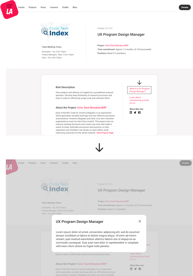
Role Description Page
We also designed the high-fidelity version of the role description pages. We had a lot of information to fit, and it was a challenge to lay out everything in an orderly manner.
Each team member designed our own versions and then compared. This is always a great design method, since designing together allows us to share ideas, discuss, and combine our best concepts. In the end, the versions that were liked most by the team were shown to users for preference testing.
The elegant version one of our designers Rosalyn came up with won out. The clean divider line really neatly solved the issue:

Different design ideas for the role description page, and the winning one with elegant dividing lines
In designing these role description pages, we reached another compromise with our stakeholder. She wanted us to prominently feature the role definition in each role description page (for instance, what a UX Designer generally is). We felt it might be redundant to list the definition on each description page, especially when volunteers may look at multiple role descriptions at a time and see the same definition.
Our compromise was to include a link for the role definition that would lead to a lightbox overlay with the definition. This way, if someone wanted to find the definition they could. But they wouldn’t have to be distracted by it if they already knew this information.
Our stakeholder readily approved of this solution.
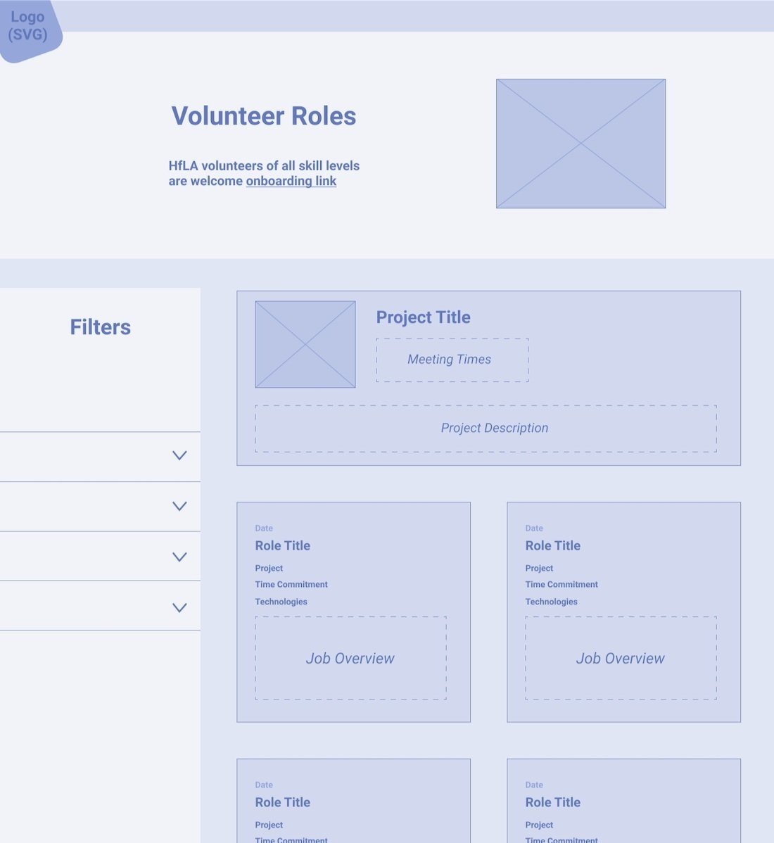
Final Designs

Final designs of the Roles Page (including post-MVP sort dropdown), Role Description page, and mobile versions
Our final designs incorporated all of the iterations preferred by our users and stakeholder together.
We also designed the mobile versions – hiding the side filter under a button, which triggers a filter overlay.
Much of the details in the role cards will be auto-generated based on the backend data about each project– including the project description, meeting times, and how to apply.
Results
In the end, our final designs were popular in user testing and approved by our stakeholders. The designs are currently awaiting the designs of the CMS portion of the roles page. Project PMs at Hack for LA will log in and submit, edit, or take down roles in real time in order to take busy developers out of this process, and allow the page to stay up to date. This will likely take a while to launch because of the complicated backend involved.
Next Steps
After the MVP, we plan to add the option to sort the role cards by importance (urgency of role), date posted, and project (currently the default is sort by project).
Most importantly, we will need to finish the CMS designs and idevelop the full Roles page. We want to make it as simple as possible for PMs to add new roles.
Reflection
I am most pleased with the amount of compromises in this project, which ended up making all sides satisfied. They often came out better than the original idea of either side that disagreed. I also came to appreciate how, even though stakeholder shouldn’t assume what users want, they often do really know the users better than most when they have been with a company for a long time. In our case, several of our stakeholder’s assumptions were validated and made the end result better.
A lot of our design work on this project focused on providing a lot of necessary information to users while trying not to overwhelm them, and I am proud that we were able to find elegant solutions to make this happen.
It was also very fun to co-design simultaneously as a team throughout this project – we often came up with the best ideas by combining all of our best ideas into one.