Case Study:
Sage App
Duration
3-day sprint
Tools
Adobe XD, Slack, Google Suite
My Role
UX Designer, UX Researcher
Team
UX: Kevin Perez, Dana Chen
The Challenge
My team of three designers took part in the Adobe Creative Jam, a remote hackathon organized by Adobe, General Assembly, and the Creative Collective. Over 115 teams from around the country participated, and had three days to design a mobile app. To our surprise and delight, we ended up winning 5th place.
We were challenged to invent an app that would help with the hiring process for underrepresented creatives. Due to the limited time allotted, we were told to focus on a main portion of the app.
The Idea
My team agreed to design my idea, a mobile app that would help underrepresented BIPOC creatives find mentors.
This idea drew on mine and my peers’ difficulties finding mentorships. A good mentor is an essential career booster, and the purpose of our app was to ease the process for underrespresented BIPOC employees at any stage of their careers. We also decided to focus on UX/UI careers for the MVP version of the app idea.
We ended up winning 5th place, out of 115 participating teams
With our limited time, we decided to pursue my idea to focus only on the mentor’s experience on the app. This was because the mentor flow was most crucial – wherever mentors would go, aspiring mentees would inevitably follow.
One of my teammates came up with the name for the app, Sage, after a wise person fittingly giving their sage advice. We also all loved the soothing, organic essence of the name for our app, counteracting the stressful topic of careers.
Ideation
In order to validate our app concept and direction, we were able to quickly arrange brief interviews with a couple of potential mentors and ‘mentees.’ We then started brainstorming the features and flows of the app.
We created a proto-persona for a mentor using the app, since we didn’t have enough time to extensively research and develop a fully refined persona. We instead focused on the main frustrations and motivations of a mentor that would want to help mentees on our app.
Sketches & Wireframes
We wasted no time sketching out ideas for different page layouts. We discussed and voted on the designs we wanted to move forward with.
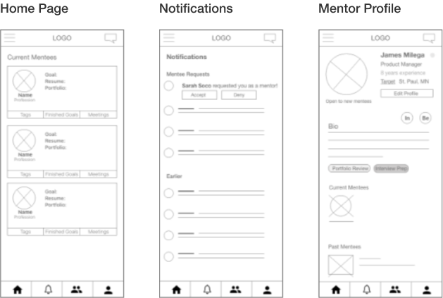
Next we wireframed our designs together in Adobe XD, setting the overall layout and flow of the app. We quickly ran a few usability tests with family and friends to validate our layout decisions.
Early low-fidelity sketches
Medium-fidelity wireframes
High-Fidelity Designs
We used gradients, transparency, and round corners throughout our app’s UI elements to convey a soothing tone befitting out name, which we hoped would ease our users’ nerves as they navigate the stressful job search and advancement process.
Our natural color palette of cloudy light blues, ocean marine, and verdant greens also fit the herbal, holistic nature of our name and and goal of providing assistance and comfort.
Homepage
The homepage gives mentors access to view their current and former mentees. The mentee cards give mentors quick access to individual planned goals, portfolios, resumes, scheduled meetings, mentoring need tags, or relevant social media.
Mentee Pool
Mentors can browse mentee cards, filtering by their experience or need tags (i.e. portfolio review, interview prep, UI critique and so on based on the mentees’ needs and the mentors’ preferred ways to help).
Mentee Profile
Mentors can also search for specific mentees. They can browse mentees’ profiles, which show up as modals with mentee status, experience level, location, bio, goals, portfolio, and resume. Mentors can choose to message them or send a sage request to mentor them.
Messaging
Mentors can also message and/or video chat with their mentees to continue their communication and feedback, and set meetings.
Notifications
From the notifications feature, mentors can quickly review and approve or ignore mentorship requests, and track their mentees’ progress.
Mentor Profile
Finally, in the mentor’s own profile they can provide their own status (whether open to more mentees or not), job title and company, years of experience, location, bio, mentorship skills, and current and previous mentees. This page also provides the mentor with access to their app settings and preferences.
View all of the Sage app pages —
Explore the prototype:
Competition Results
To our amazement, we were selected as top 10 finalists in the Adobe Creative Jam out of 115 teams (in fact, our raw score in the ranking tied us with one other group for the #1 spot).
We were next invited to present our app to the participants and viewers in a livestream, to be judged by a panel of designers from Adobe and representatives from the nonprofit Creative Collective.
After our presentation, the judges mentioned how smooth and intuitive our app was. One Adobe designer that particularly liked our app mentioned how calming and “zen” it made her feel. The judges ended up awarding us 5th place. As top 5 finalists, we received several awards: a free year of Adobe Creative Suite, plus Amazon and General Assembly gift certificates.
Reflection & Next Steps
Participating in the Adobe Creative Jam was a wonderful experience. The time crunch was certainly challenging, but my team designed an app that we were very proud of in the end. We did not expect to be finalists, but that was a cherry on top of a very fun and smooth teamwork experience.
If we were to continue and bring the Sage App to life, we would spend more time conducting UX Research, interviewing and testing target users. We would run all feasibility by our developers and make any adjustments if needed. And we would work to expand the scope of the app to underrepresented employees in all career fields beyond UX Design.


